UNIVERSITY OF MARYLAND WEBSITE RE-DESIGN
As a student at the University of Maryland, I must do what every other student does every semester: enroll in classes. I remember being a freshman and opening the current Testudo Office of the Registrar page for the first time, instantly feeling lost as I looked at the dull, overwhelming website and had no sense of direction on where to click to sign up for the classes I wanted.
This year, I reflected on that time and wanted to improve the online presence of the page that every university student uses. I decided to take on this project to improve the usability and visual of the page using Figma. Additionally, I contacted the Office of Registrar in an attempt to change the current page.
NEW WEBPAGE by MATIAS LEVI
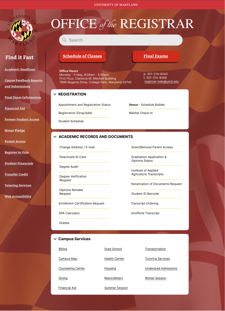
Modern Visual Design
The updated page uses a clean background with Maryland’s colors and branding, giving it a more polished, cohesive look. The rounded buttons for “Schedule of Classes” and “Final Exams” are bold and easy to spot, making navigation simple.
Clear Hierarchy and Spacing
Content is broken into collapsible sections (e.g., Registration, Academic Records, Campus Services). This reduces visual clutter and helps students focus on exactly what they need without scanning through endless lists.
Improved Navigation
The addition of a search bar at the top is a huge usability upgrade. Students can quickly type what they’re looking for (e.g., “transcript” or “degree audit”) instead of manually digging through menus.
Consistency and Branding
The use of UMD’s official branding (flag background, university seal, and color palette) makes the page feel professional and connected to the school identity. It creates trust and consistency with other official university sites.
Better Accessibility
The higher contrast text and larger clickable areas (like the bold red buttons) improve readability. The clean spacing between items makes it easier for users with different accessibility needs to navigate.
User-Centered Layout
Information is grouped logically into expandable panels, which allows students to collapse sections they don’t need at the moment. This prioritizes ease of use and reduces the chance of feeling overwhelmed.
CURRENT WEB PAGE
Outdated Visual Design
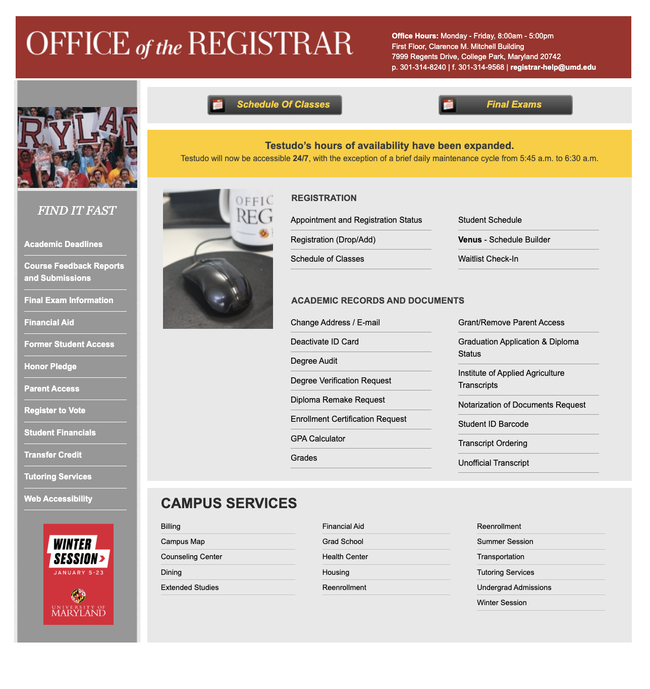
The site appears visually outdated, featuring plain gray boxes, limited use of modern typography, and minimal graphics. It lacks a visual hierarchy, making it difficult for users to determine what’s most important at first glance.
Poor Use of Space
The page is very text-heavy and boxy. There’s no balance of whitespace, icons, or visuals to guide the eye. For a registrar’s office (with numerous forms and deadlines), clarity is essential, but the layout can make it feel dense.
Lack of Interactivity
It appears static, lacking expandable menus, search bars, or filters. Modern websites typically feature interactive elements that enable students to quickly locate the information they need (e.g., a search bar for "transcript" or "degree audit").
No Clear Call-to-Action
There are multiple buttons, but the hierarchy is weak. The large yellow banner about Testudo’s availability grabs attention but doesn’t help a student accomplish tasks like registering or checking grades.
MADE WITH FIGMA


